This past autumn, I had the honor of being asked, by one of my long ago wedding clients, to create a new piece of art to celebrate their tenth wedding anniversary. I was asked to make it the same size as the original one, follow roughly the same layout with an arch of lettering at the top, include the same winter plants and flowers as used in the first artwork, and use essentially the same colors. The new part was to be a lovely poem, by Rumi, which I could interpret in a way that would live comfortably within these parameters. The anniversary was to be celebrated just after Christmas and, due to life events, the lead time for creating this piece turned out to be only three weeks, less than half what I usually request, and the rush fee gladly paid. So between December 7, when the commission finalized, and December 26, when I rushed it to the San Jose UPS hub (all of the UPS Stores already being closed that day), I was engrossed in my studio nearly every day working on this commission. I documented its creation with my camera, and with the permission of the anniversary couple, I will share some of the photos and process of its creation here with you.

The first step in the process, after receiving approval of my thumbnail sketches from the client, was to make a mockup of the entire piece at actual size on layout paper, 22.5 x 30 inches, equal to a full sheet of watercolor cotton rag paper. I used color copies of the foliage I had painted for the original piece ten years ago around the edges, and wrote all the text out in the sizes I guessed would be most appropriate. You can just about see the pencil lines of the Van de Graaf canon I use when making a layout, whether a broadside or a pair of book pages, to give the most pleasing margin proportions. I have written elsewhere about this canon and continue to use it as the most reliable way to place text and image on a page.
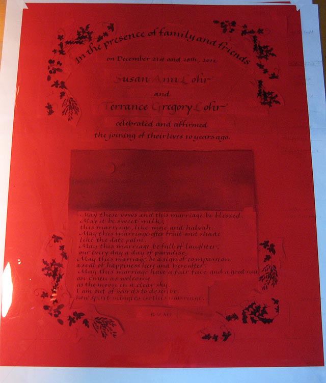
Here is an old graphic artist’s trick that I still find useful when doing a traditional layout, that is, not using the computer in any way. A piece of red acetate will let you see the layout while obscuring the cut lines, and adjustments can be made to spacing. Of course you can’t see anything that’s red underneath, but it is still a very useful tool in my flat file. I have since discovered that a digital photograph will sometimes do the same trick by shrinking it all down. One of the adjustments I made was to move the center of the poem slightly to the left, thereby moving the entire poem slightly to the right. In this case the optical center was different than the actual center of the poem, due to one much longer line.
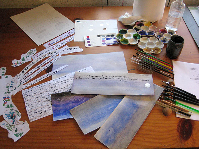
I had made a preliminary watercolor for the night sky that would appear above the poem. I experimented with a few more color values and intensities, and finally decided that my first instincts were right, that the more pastel appearance would look better and not overwhelm the rest of the piece. The night or two before the moon is full, it rises while the sky is still blue, so this was celestially correct. I also modified the width of the painting from the full width of the whole artwork to the narrower width of the writing only, which gave the foliage border breathing space and was more harmonious. Here you can also see some of the other tools and materials I used: clockwise from top left, the thumbnail pencil sketches, the gilding and paint color trials, my indispensable roll of paper towels, distilled water in a drip bottle and a water rinse jar, various metallic and opaque watercolors and gouaches mixed in white ceramic palettes, mixing brushes, Winsor Newton Series 7 painting brushes, the printed texts, broad edged pens in four sizes, a classic ruling pen for drawing vines and laying down masking fluid for containing the watercolor, a rough eraser for taking out light smudges, and all the handwritten text to be included, shown here without their innumerable little pieces of low tack artist’s tape used to secure each piece to the art paper while doing the final writing. Other materials were also used, but not shown in this photo.

Once I had everything positioned and lightly penciled on the final piece of full size watercolor paper, I used my ruling pen and some masking fluid to draw double lines around the area to be painted with watercolor, and masked the surrounding area with waxed paper to prevent splashes or drips from escaping this area.

Here is how the watercolor looked when it dried, and here is where I began to question the sanity of the idea I had proposed to include a watercolor vignette in this piece. I know very well that water media will warp the paper, and this piece was really too large to tape down around all its edges, or at least that did not occur to me in my rush. I considered my options, and given the time constraints decided it would not be possible to do it over, especially as I was pretty content with the value and hue of the color. So after an hour or so of teeth gnashing, I moved on to Plan B, a technique I have often used for this situation. Flattening the entire sheet was accomplished by the use of a very large plastic bag saved for this purpose, a large piece of blotter paper thoroughly dampened, and some Hollytex, a smooth fibrous material which prevents media migration. All was sandwiched with the blotter paper on the bottom, then the art paper, then the Hollytex over the painting, and the whole enclosed in the plastic bag, weighted at the open end with a long straightedge and left overnight to completely relax the paper. The next day, I removed it all from the bag, sandwiched the damp art paper between two clean dry sheets of blotter paper, again masked the painting with Hollytex, then put all between two large pieces of corrugated cardboard and under a large piece of heavy tempered glass on my back table. Leaving the space heater on in the studio overnight, I said a little prayer and left it to dry.
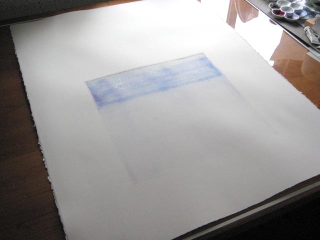
The next morning, it had flattened sufficiently for me to carry on to the next step. Here you can also see the little bit of silver powdered watercolor I had sprinkled into the wet night sky with a very light touch. Breathing a sigh of relief, I moved over to the drawing table.
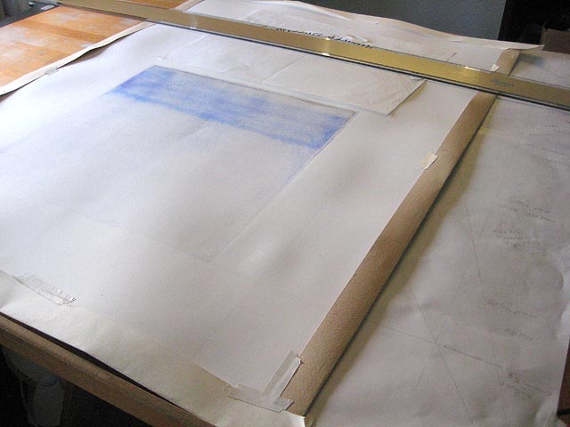
First, I enclosed all four edges of the art paper in protective strips and taped them to the art paper front and back. I have had too many edges of otherwise pristine artwork marred by my own dirty fingers smudging the edges when picking it up, so this precaution is born of hard experience. Then, using my longest T-square and the mockup, I transferred the writing lines to the Arches 140# hotpress watercolor paper lightly with a soft pencil. A hard pencil will give a light line but is a little harder to erase, so I prefer using a softer pencil with a light touch.

The calligraphy was completed in gouache before any more painting or decoration was added. This is one of the most nerve-wracking parts, since a mistake will show up more clearly in the lettering than in the border, so another big sigh of relief was expressed when the lettering was successfully completed, and proofed several times during and after the process. I am a good speller, but calligraphy is primarily a right brain activity, looking at the shapes of the letters rather than their meaning, so the strips of trial lettering for each line, taped above the active writing, were very important.
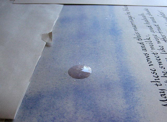
Gilding comes after the calligraphy and before any of the decorative painting. Since this piece was for a tenth anniversary, aluminum was requested as that is the traditional metal for that number of years. I had heard that aluminum was hard to work with so put out a call for advice from my fellow scribes on Facebook, and two sister scribes came to my rescue with the recommendation to use Rolco size for the base. Gold leaf will stick to itself but I believe aluminum is thicker and offers no such second chance so I needed a good sticky size. Rolco worked beautifully and gave a mirror finish. The only trick was to lay it down rather quickly to avoid leaving brush strokes in it, but after that it worked a treat. I had never used this base before, but since I have a cupboard full of various sizes that work only intermittently, I was beyond grateful that this size worked so well and made the leaf so shiny. Above is the base for the moon before laying the leaf and burnishing it through glassine.
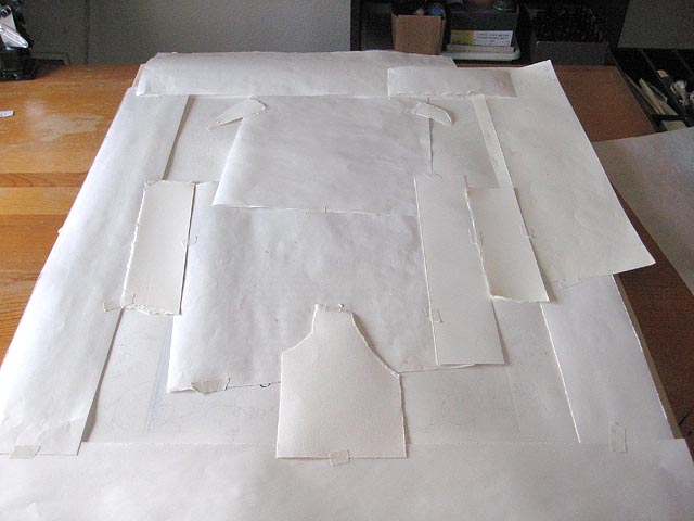
Once the calligraphy was completed, the moon gilded, and the border design sketched in pencil, the entire piece was masked once again except for the border areas to be painted. This again is a protective measure, since a dropped brush or smear can ruin an entire piece of work. Even with the masking, accidents can happen, and one afternoon after working for many hours, the brush wobbled in my hand and nearly dropped onto the unmasked area. I rinsed my brush, put it down, and called it a day. There was no time for any calamity on this commission, so despite working as quickly as possible, a careful approach was very necessary.
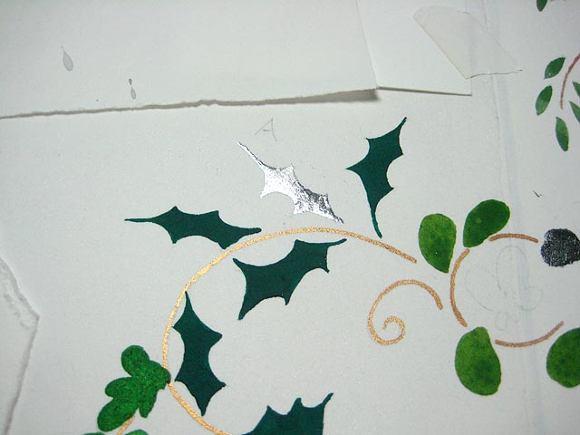
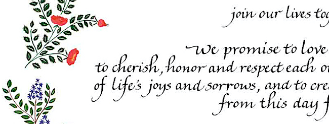
Some of the leaves were also gilded with aluminum. Here I have subsequently painted some of the vines and leaves, but you can see where I lightly penciled an “A” to show which leaves would be gilded, to give a balanced effect of shine amidst the painted border. Then the rest of the border was painted in gouache, using metallic gold paint for the stems, four shades of green for the leaves, berries added in red and white to the holly and mistletoe, and the first letters of each name flourished with more of the gold paint in the ruling pen.

The last step, aside from carefully erasing the lines, was to use my finest tip embossing tool and a piece of tracing paper to add veins to the gilded leaves.

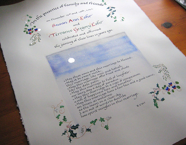
The finished artwork was photographed mostly square by standing above it on a stool with a handheld camera. A little less foliage than the rough layout so as not to overwhelm the other parts, and the addition of the shiny bits, all came together, and just in the nick of time, to make a piece that reportedly brought great joy to the recipients. This art was made completely in the old school way, with the computer being used only for communication. It is in the creation of pieces like this that I am grateful for the traditional calligraphy training I have pursued and the ability to share it with others.


Stunning! And, what a treat to witness the entire process. Thanks for sharing your steps in this beautiful creative work.
This is wonderful Cari! Thank you for taking the time to document your steps so well – very impressive that you thought of the rest of us while you were charging through getting this done for such a short deadline. I learned a lot from this! And…it is SO beautiful.
Cari,
This is so beautiful. Thank you for sharing the skill and hard work of your art with us.
What a beautiful piece and lovely documentation of the process!
Absolutely breathtaking!
A lovely tutorial! Thanks for sharing so beautifully.
Dear Cari,
I hardly breathed while reading the details on the process of this beautiful piece. I am a hobbyist calligrapher, but have learned a lot from this post. Would you have any objections to me forwarding it to my guilds on Vancouver Island?
Thank you so much for sharing.
Janet
Thank you Janet. Share away! That’s why I wrote it, so this kind of knowledge does not get lost. I would be honored to have it shared far and wide.
Beautiful work! I’m so glad that you shared not only your process but hints on how you developed your expertise. It’s important to realize that every piece of work we create is made partially possible by all the skills we’ve developed through hard work, study, and repetition. “How long did it take” can be 20 minutes; on the other hand, “how long did it take” can mean “a lifetime”.
Thank you all for the nice comments. I was motivated to record my process by another sister scribe on Facebook who did a similar recording of her process and by how well it was received. It was a little amazing to me how much I pulled up from my past training while working under pressure and how little is understood of what my process is. It is so true that a twenty minute job truly does take a lifetime of experience even though it may look like it was “dashed off.” What is so funny to me is that nowadays when I tell people what I do, they immediately ask , “What do you do if you make a mistake?” which I never used to hear as often before computers came along. That could easily be the subject of another tutorial, but fortunately I made none on this job and had no need to show what I would have done. A friend shared this post on Facebook with the comment that the “meme” going around saying “Artwork IS Work” was well illustrated by the description of creating this piece. Yes, it IS work. And no, it can’t be made on a computer. But it can be shared via computer, which is rather nice!
Sensei Cari,
Thanks for creating such beauty for your client and sharing your process with the world. You failed to mention that, unlike Bob Cratchit, you DID have to work on Christmas Day and Winter Solstice and, and, and. Your Ghost of Christmas Past will have something grand to show when she next visits you.
Oh darlin’, she will have LOTS of grand things to show me. You make me laugh. I was a bit Scrooge-like – why are these holidays interfering in the conduction of my business and why are these UPS offices closed today! Bah!
Cari, this is truly fascinating and I do appreciate your taking the time to really talk about the process. I’d never heard of that Rolco sizing before, and think I shall play with heavier leafs now. Thank you, thank you, and thank you, again!
It is refreshing to learn that you have been trained in the traditional paste-up and layout techniques that I also learned and that these methods played key roles in the success of your piece. It’s important to be able to “think on your feet” and execute a process when the digital/computer methods may not be available.
Thank YOU, Tamara, for sharing your commission on Facebook. The great response you received from people there motivated me to keep my camera by my side for my own commission. Also, I was working so fast, I really did want to remember what I did! I have always kept my working papers if called on to do a commission again (paint colors, nibs sizes and such), but the digital camera has made that so much easier to do now and I use it to “take notes” all the time.
Fascinating to see the step-by-step process, all the different skills that come into play — and especially all the little tips and tricks for preventing disaster! Thanks for sharing this in so much detail.