

During the summer months of this year, I spent many hours perambulating between my studio and my computer screen, creating a modern manuscript in a medieval style. The job inquiry came in late May, and the final artwork was delivered the first week of October. During those four months, I used just about every trick in my creative skill set: editor, calligrapher, painter, graphic artist, printer, and packer.
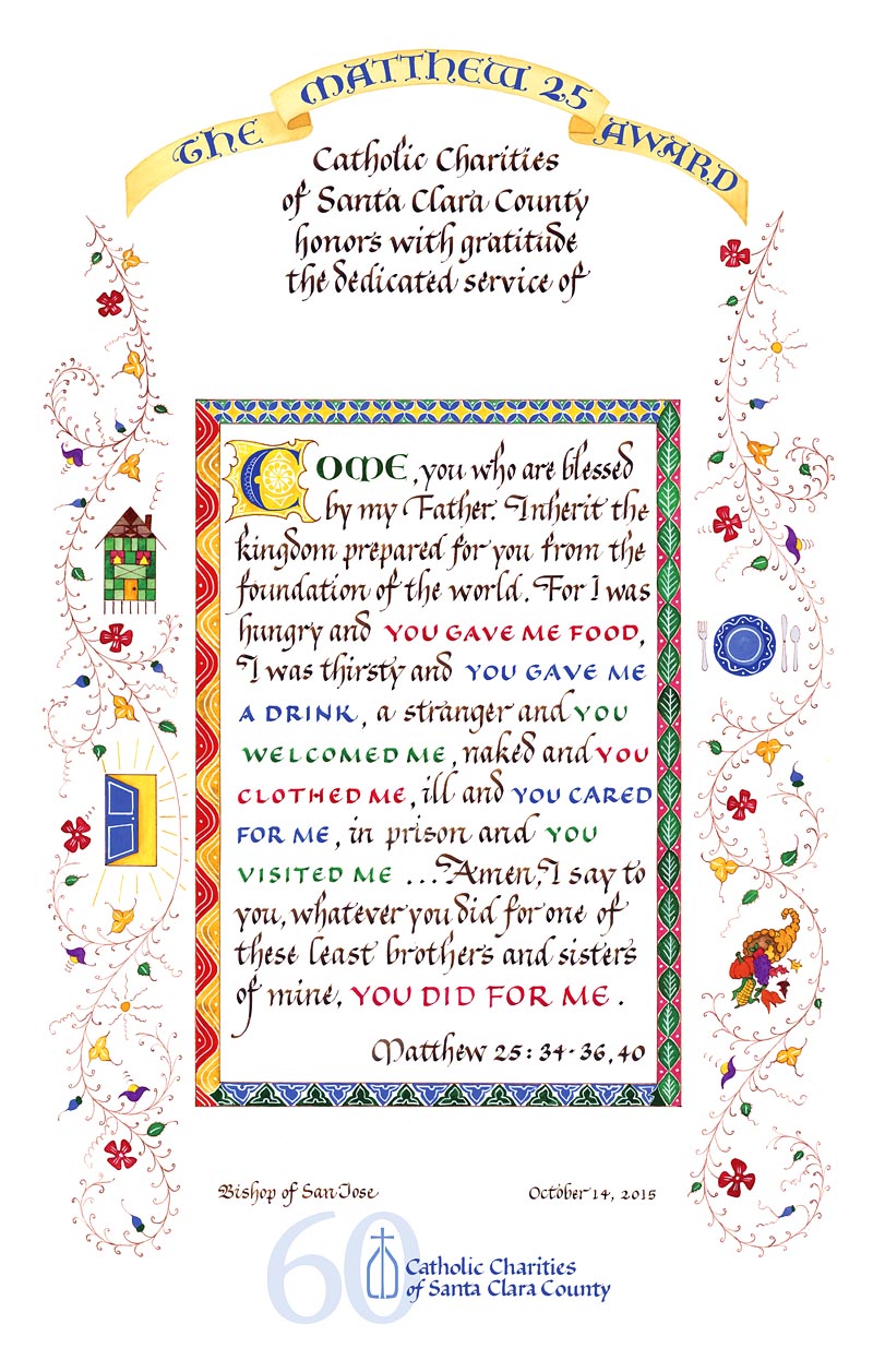
The project began, after the initial telephone consultations, with some pencil sketches. The client, Catholic Charities of Santa Clara County, wanted to visually convey the nature of the services they provide to the community. I offered some ideas, beginning with an image of opened doors to contain the well-loved biblical scripture known as Matthew 25. We tried out various versions of the text, ranging from the entire passage to just selected phrases. The images of opening doors were garnered from internet sources to aid in the drawings.

A more traditional design was wanted, so I combined aspects of two designs into a new drawing. Then the calligraphy trials began. The client had expressed a desire to emulate the medieval style of my Fra Giovanni print, so a copy remained on my work table as I progressed. Small pencil drawings were made to be included later in the delicate vine style of medieval border.

Since the quotation was to be the centerpiece of the design, that was explored first, to figure out proportions and sizing. Happily, the lettering style requested was the bâtarde style which I was scheduled to teach in October, making my summer practice congruent with my fall teaching gig. The final lettering was done on smooth layout paper with walnut (peat) ink to emulate the brown lettering of old manuscripts. I made extra letters in the right margin to substitute for less-than-lovely letters during digital compositing. I found it necessary to write this ordinarily wide hand narrowly to fit the text, and make the interlinear spacing more generous for a contemporary feel, allowing some air for the letters to “breathe.”
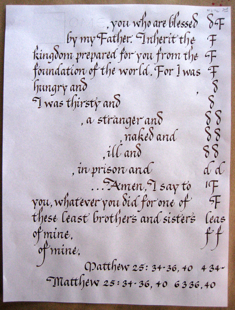
For this I used my “Kells” guidelines: twenty years ago, I studied my big Dover thrift edition of the Book of Kells, and discovered that the line spacing was not every other line, or every third line, but about every two and a half lines. The guidelines I drew from this study, and reproduced in different sizes, have served me well over the years, not only for uncials and other majuscules, but also styles with short ascenders and descenders like bâtarde.

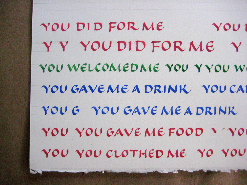
I lettered the highlighted parts of the text in small caps and in color with gouache on hotpress watercolor paper.
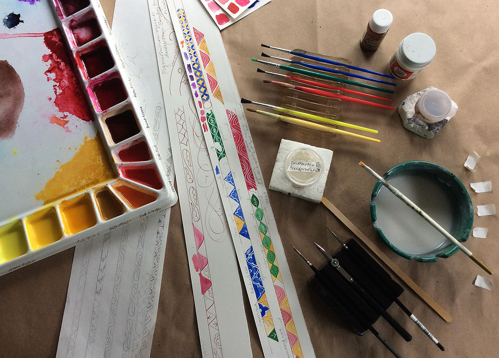
Color trials of the borders were also made on an Arches 90# hot press watercolor paper. I like to use mixing brushes with handles in the same color family as the paint to help me keep the media sorted. An old ashtray makes a great water dish with a place for the brush to rest.
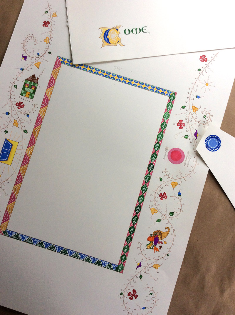
The banner was painted on a white Fabriano Artistico with shades of yellow gouache. The lettering, done with a pointed pen and ultramarine gouache, was made separately in a versal style, and then combined with the yellow background banner using Photoshop magic.

Work on the final border design began with pencil outlines of the center rectangle and of the vine border, loosely drawn around the small pictures. Then I used thinned down acrylic ink in a pointed pen for the drawings, and the same ink in a ruling pen against a straightedge for the inner border. The acrylic ink made the outlines waterproof for filling in with color paint.

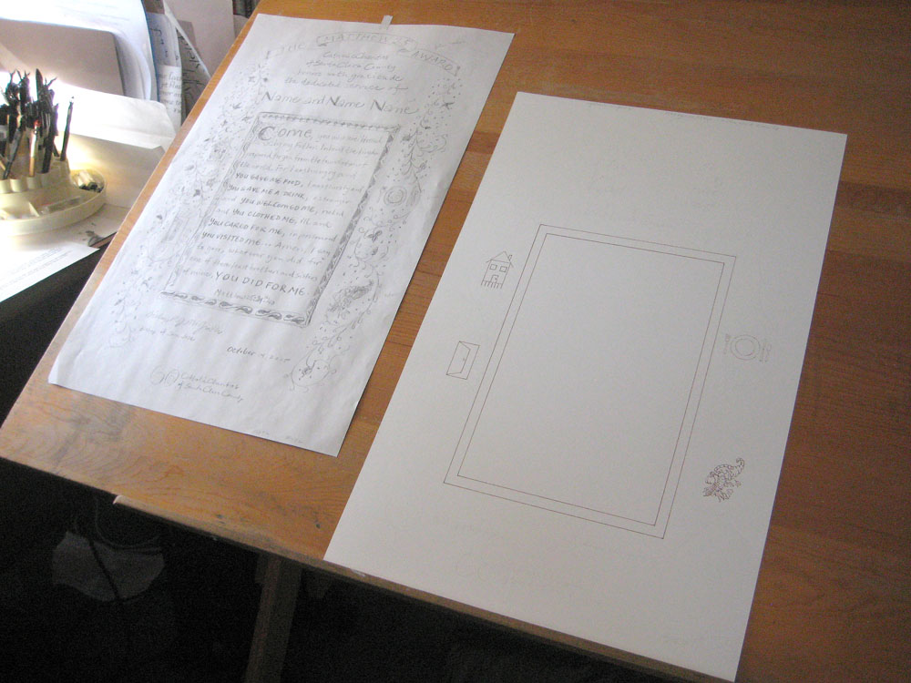
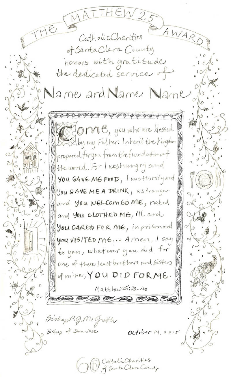
The final design sketch was ever near as I began work on the final painting. The original sketch was drawn on a legal size piece of paper, but later enlarged and printed on larger layout paper to approximate correct proportions for the finished work.
The final paintings: the red plate looked too pink, so I painted an alternate blue plate which was more pleasing, as well as being the client’s logo color. All of the painting was made lighter and more contemporary looking by adding white detail on top of the solid colors with a 000 brush. Because the prospectus was to create a print that could be given multiple times, I made the various parts of the final artwork on separate papers, unlike a job where I create the entire work on one sheet of paper. This method of working requires a good working knowledge of digital design, as I scanned each section into the computer and composited them all in Adobe Photoshop and InDesign. The weekend workshop I took long ago through my local university’s extension has served me well, as I am able to translate my calligraphy and painting into digital form and create prints, books and commissions like this one. Otherwise I would have to outsource it, which is not how I like to work.
The client’s logo and the “60” were dropped into a separate layer at the bottom of the design. The “60” stayed in the original typeface, but I traced the lettering of the organization with a broad-edged pen to meld better with the rest of the calligraphy.
After considerable compositing, I had nearly 40 digital layers in Photoshop, and nine layers in the InDesign page layout, before it was ready to print. The photo below shows one of the tasks in Photoshop. I had originally written the entire quotation text in brown ink, then rewrote the important phrases in red, blue and green gouache. In the process my spacing became tighter, and though I was happy with the lettering, it didn’t quite fit with the foundation text. So into Photoshop it all went. I separated out each phrase, the one with preferred spacing in the brown ink underneath, and the one whose spacing needed correcting in a layer on top. Then it was just basic letterspacing to get it to look right, or kerning as it is known in the world of mechanical (now digital) letterforms. You can see in the “you welcomed me” phrase how each letter is selected and given more space between them.

I made the final prints on my newly acquired Epson 3880. It turned out to be a good purchase and just right for this job, for it takes non-standard art papers, in this case Arches 90# hot press watercolor paper. A service bureau would likely not have printed on a fine art paper for me, but this was necessary so I could then write on the prints with a calligraphy pen afterward, to add the names.

The printing only seems fast in this photo but it’s a nice visual of the feeling I had watching these things whoosh out of the printer after so many weeks of hand labor on the original art.

Below is the pencil mockup of the proposed design, and below that the finished print before adding the names.
On the final prints, dots were added with gold paint for texture in the border, and the names lettered in alizarin crimson and flourished with the same gold paint, as seen in the detail photo at the top of this post.
I mentioned my packing skills, but have no picture to show. In another life, I worked in the shipping department of a small pool supply company, and later helped my husband run his family moving and storage business. Packing is a skill like any other, and I fretted over the delivery of these awards. Framed, they were 20 by 28 inches, and with the corner protectors were nearly 30 inches high. I couldn’t find individual boxes for each one, much as I would have liked to. I didn’t have time at this point to hang out in the Michael’s framing department and try to snag those rare boxes that would fit a single framed piece. But UPS had a picture box exactly the right size, double walled, and the three awards fit perfectly and tightly within. These framed artworks were not going to be damaged on MY watch.
All in all, this commission was a delight to complete, and I especially liked taking one of my prints to my workshop later in October to show my students. Rare they may be, but there are still occasions to use the skills needed to create a medieval-style piece of calligraphy art.


Hi Cari:
This is awesome, bravo. I can’t believe the amount of work, skill and art that went into this creation. What a journey! Thank you for posting all the steps that went into this commission.
Thank you, Christina. Having faithful readers like you makes writing posts like this worthwhile.
Very interesting. I am in admiration of your technical skills. How many prints were needed? And of course, the question all scribes want to ask, were you compensated fairly for all this intricate work?
Jane, only three prints were asked for this year. And yes, I believe I was pretty well compensated, although it would have been far too difficult to calculate my hours!
Love how you modernized the ‘medieval’ look for the awards. The beauty of the award document is a fitting tribute to the recipients. Thanks for sharing your detailed process for this commission.
Thanks for reading, Conni.
Cari….you are truly an amazing calligrapher! And how special to take the time to share the process. Thank you.
wow! Thats all!
Love how you took all those centuries of art and processed it through you (using tools from all those centuries!) for today. What a lot of work and a beautiful piece!
You truly are a Master of our time. I admire your skills and patience, neither of which I have an inclination to master. You are worthy of being a national treasure. I hope you have, or will submit this post to Bound and Lettered. You didn’t mention that your skill as a writer was also needed to make this blog post coherent and interesting to read. Bravo, my friend.
Cari, Thanks so much for sharing your process, the writing for which is part of a great piece of art!
How the monk in the drafty chambers with his hairy vellum would certainly envy you (and us, for getting to share in this process)!
Such a long way from the old Ren-Faire days. I love how you keep it relevant and it’s always interesting. It’s beautiful, Cari.