
 On many a calligrapher’s bookshelf, dwarfed by instructional manuals and larger collections of contemporary calligraphy, are the small, spiral-bound books known as the Calligraphers Engagement Calendar. The lucky archivist will have managed to collect the twenty-plus editions that were published between 1978 and 2004. There can be precious few pages bound between covers that are as packed with good design, impeccable lettering, and inspiring quotes as the Calligraphers Engagement Calendar. Many times I reached for these gems when I needed an idea for a letter style or a layout. It was in looking at these calendars that I first began to really understand such concepts as personal variations in hands, or the difference between positive and reverse layouts. Teachers of calligraphy still show editions of the calendar to their classes to illustrate design and letterforms. Except for the early calendars which were printed in two colors, the calendar was printed exclusively in black and white.
Besides outstanding lettering, the hallmark of each year’s calendar was its theme. Over the years this ranged from the obvious choices like art or nature or love to more challenging ones such as sports and games and the theme of color (for art printed in black and white). Occasionally an identical quote was done by two calligraphers, giving an opportunity to see different interpretations of the same text.
Perhaps more than any other publication, the calendar served as a unique vehicle for communication among calligraphers. There are now many calligraphy books and exhibition catalogs now, but during the early years of the calligraphy revival there were only a few basic instruction books, with fewer examples. The annual calendar showed what was going on in the calligraphy world in a grass roots sort of way. Annie Cicale lived in Montana at the time and was ecstatic when she and a friend, Gwynn Mundinger, had artwork accepted into the 1984 calendar. They thought all the best work was being done in the big cities. The calendars helped her to understand design, that it was “much more than just ruling up and slapping some letters down,” but that all the parts had to work together. She remembers thinking that some of the early calendars had some very conservative designs, not realizing until much later how very difficult it is to do a simple, elegant layout.
During the late seventies, calligraphy was “red hot,” Alice told me when I was researching this article. She should know, for she was a professional scribe in New York City for at least fifty years. Donald Jackson, former scribe to England’s queen, had made a sweep through the United States in 1976, leaving in his wake scores of scribes enamored of the written letter. In 1977 the seeds of the engagement calendar were planted with the production of a 13 by 20 inch wall calendar, designed as a fund-raiser for the recently formed Society of Scribes in New York. The moving force behind this project was Paul Freeman, a dynamic fellow described affectionately as an “an absolute monarch.”  He selected twelve contributors for the wall calendar, but by 1978 so many more people had joined the society that the 52-week desk calendar was born. (With the synchronicity of all great ideas, a very similar engagement calendar was also produced in 1978 by the Society for Calligraphy in Los Angeles.) Because of the number of submissions for the 1978 calendar, a jury picked the pieces to be included, although the forward by Paul Freeman did admit to inclusion of artwork by some scribes based on their years of contribution to the craft. Not too surprisingly, the theme of the first calendar was calligraphy and lettering.
In 1979 Paul Freeman worked with Taplinger Publishing Company to publish the Calligraphers Engagement Calendar as a Pentalic book. For the next three years he produced a larger slicker calendar than that first wall calendar. These early calendars were filled with small gems, as well as awkward early pieces by “the greats” and the “never heard from agains,” and the idiosyncratic calligraphy of Paul Freeman himself. The calligraphy in these early editions was distinguished by its simplicity of presentation and its conservatism; it would be some years before scribes submitted things done with screens, reverses, or even brush writing.
The Society of Scribes continued to publish a guild engagement calendar in 1979 and 1980, but only published one more Calligraphers Engagement Calendar in 1983, after Paul Freeman’s death and the lack of an edition in 1982. Distribution, however, was an enormous job for the society, so Eleanor Winters approached Taplinger to pick up the calendar again for 1984 and Taplinger agreed.
The calendar stayed with Taplinger through 1987. In the summer of 1987 everyone’s worst nightmare happened: a fire in the studio of Eddie Francolini (art director at that time) destroyed all the artwork for the 1988 calendar. After the fire, Pam Shilling Johnson, owner of Pendragon Calligraphic Supplies, jumped into the breach and published a onetime calendar for 1988. Under the gun of an almost impossible deadline, she managed to put an invitational calendar together. Of the same size and format, the Pendragon Calligraphic Calendar was not the “official” calendar, but filled the 1988 slot with a quite lovely edition on the subject of children and childhood. It is pictured above in the center of the top row.
Faced with the potential demise of the calendar after losing Taplinger, the new editors, Carole Maurer and Eleanor Winters, contacted dozens of publishers before finally signing a contract with Universe Books of New York, a top publisher of calendars, in 1989. In a step toward quality and sophistication, the new publisher began to print the cover in four-color. John Stevens, one of the world’s best-known calligraphers, was asked to do the cover the first year, 1989. Alan Blackman’s cover for the last Universe edition in 1996 was memorable for his trademark vibrant colors, and for a calendar printed in black and white, everyone was very glad his cover got to be in color. Other cover artists included Alice, Dick Beasley, Timothy Botts, Larry Brady, Emily Brown Shields, David Gatti, David Mekelberg, Charles Pearce, Julian and Sheila Waters. For ten years, Marcy Robinson handled all the production and pasteup by hand, until the job was eventually transferred to the computer. The calendar returned to its original name, Calligraphers Engagement Calendar, dropping The Artful Letter, and continued to be produced until the last one in 2004.
Many first-time contributors were included in every edition, and being accepted was a feather in a scribe’s cap. Hundreds of entries reflecting all abilities came in every year from the United States and Europe as well as further afield from Australia, South Africa, and Japan. The judging criteria of the editors was strict, the judging done silently and taking days to complete. The most important criteria was the quality of the letterforms, which consistently took precedence over illustration. As the years passed, the calendar grew up with the field of calligraphy, presenting what was current and showing off some of our best to the rest of the world. By submitting a piece to the calendar, artists hoped to join the ranks of published calligraphers and to leave their mark in the greater world.
First published in John Neal’s newsletter in 1998, reprinted with revisions in 2002. This version has been updated in February 2022 to reflect the fact that the calendar has not been produced since 2004, more’s the pity, The calendar is part of the history of the the calligraphy revival that began in the 1970s and will be of interest to the many who knew and loved it well, and to newer scribes who can still learn from the jewels within its pages.
You can still find some of these calendars at John Neal Bookseller by following this link. Ask him what he has, for they are not all listed on his website and some will be in very limited quantities.
The calendars pictured above are adorned with cover art by the following artists:
1986, Marjorie Corbett, Magic. Top left.
1988, lettering by Reggie Ezell, dragon by Jerry Warshaw, Children and Childhood. Top middle.
1989, John Stevens, Art. Top right.
1991, Rene Schall, Performing Arts. Bottom left.
1994, Christopher Calderhead, Communicatio. Bottom middle.
1996, Alan Blackman, Color. Bottom right.
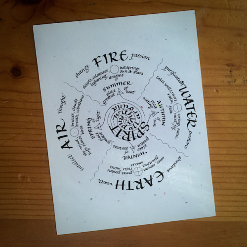 I did have my art accepted, one time, to the calendar, and can not now put hands on the issue it appeared in. I think it was in the 2000 or 2001 issue. You can imagine I was pretty chuffed. I did find a postcard I made from the art. You may recognize it as the prototype of the Five Sacred Elements card I created in 1999, that one in full color.