
I’ve finally completed my year journal for 2012. This year I wanted to try a different binding than the usual softcover journals I make with longstitch or cross-structure bindings.
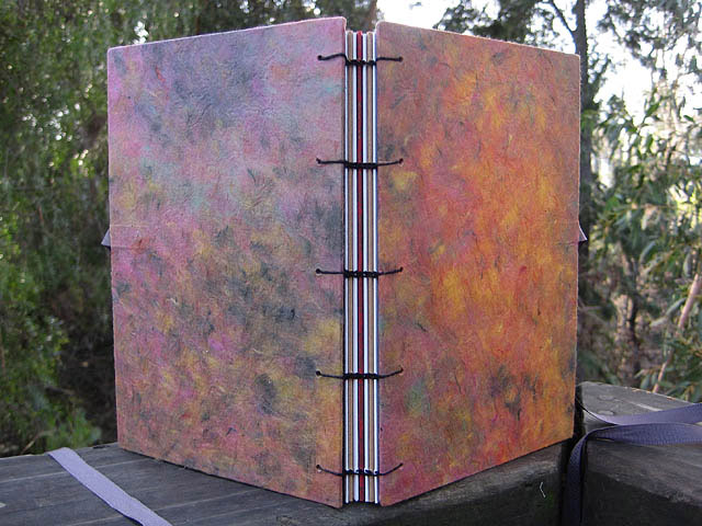
A journal that lays flat is always preferred, and a Coptic stitched spine delivers this very nicely. I’m considering this stitched spine for a book project, so I wanted to try it out.
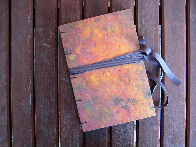
I left the spine stitching fairly loose to accommodate inclusions in the journal throughout the year, in various pockets in decorative papers wrapped around every other signature. I really debated about the ribbon tie closure, but am glad I included it to help keep the book closed. As the year progresses it will fill up with this and that.

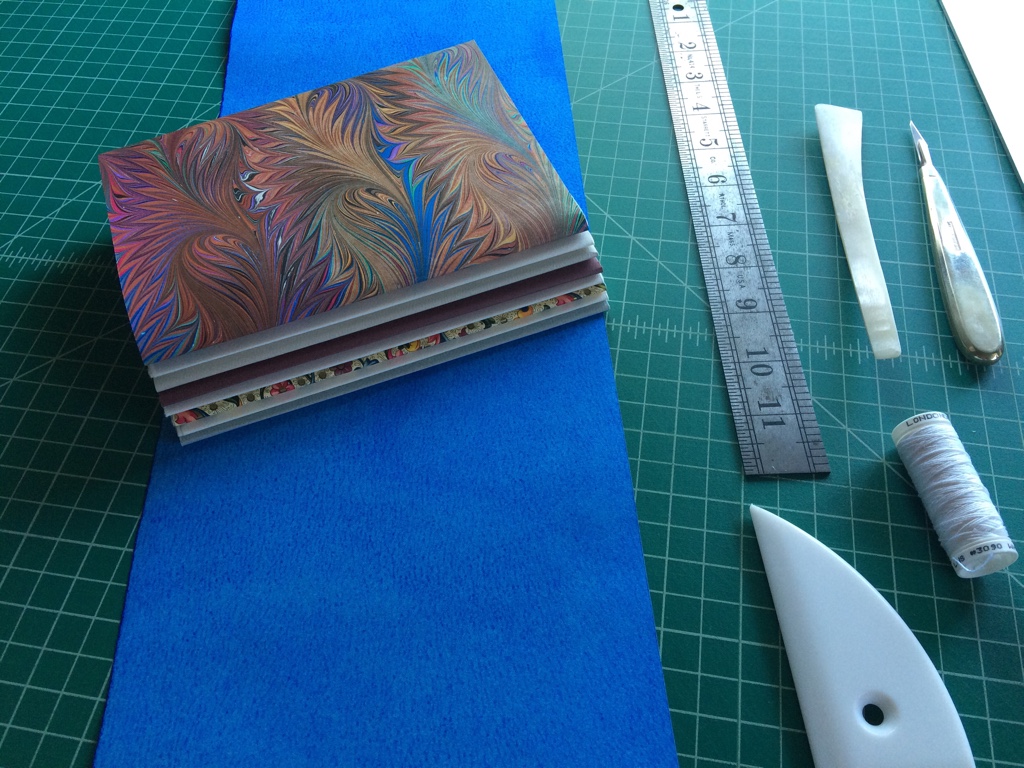
Some of the tools I used in making this book. Clockwise from top left: a mix of Jade PVA glue and methylcellulose, with a flat brush for applying along narrow edges; a batch of clips along with folded paper towel bits to keep them from leaving an imprint when they are used to hold the signatures together after the sewing holes are punched; my Japanese screw punch and a sample of paper on book board to find the right size punch (1 mm) for making sewing holes in the cover boards; an awl for punching sewing holes in signatures; scalpel for cutting and trimming paper against a straightedge (not shown); a hard and soft pencil; a bookbinding needle bent under heat and pressure, to sew between the signatures ; my favorite “bone” folder made of Teflon; the folded paper I used to arrive at five equidistant sewing stations; the finished book.
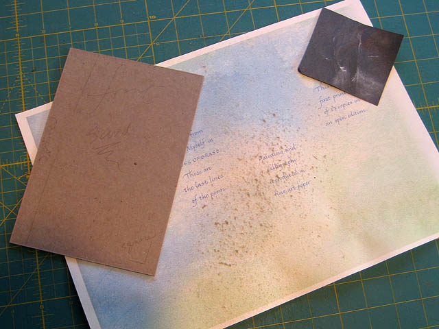
Early on, an important tool was some #320 sandpaper to round off the sharp cut edges of the book boards before covering them with paper (and using an old color proof sheet from last year’s project, Bequeathe Love) to catch the fuzz. I had planned to take more photos of the process, but it was so perplexing to me I forgot the camera and concentrated on trying to get the structure correct. Instead of following the directions I received in a class, I struck out on my own into uncharted territory, with mixed results. This is how we learn, from our mistakes. I thought of rebinding the book, but will probably not, as I would much rather begin writing in it. I’ll make another, smaller prototype of this binding to see what will work.

The inscribed title page. The 1 is a little wonky; writing in a bound book is tricksy when your hand doesn’t fully rest on a flat surface. Still, I had a little fun with a couple of flourishes to balance out the page spread.

Wanting to work with traditional page design, I drew the canon inside the book. I have written elsewhere about the Van de Graaf canon as described by Jan Tschichold. When I began to make this journal I found in my studio a stack of already trimmed 100% cotton bond paper cut to the size of 7.5 x 10 inches. I couldn’t remember why I had cut these pages to this size, but after looking through some old class notes on book design I discovered that this size is the classic 2:3 page proportion, visually pleasing at 7.5 by 5 for a single page. In keeping with classic proportions I decided to draw the margins and text blocks on one page spread for reference. These proportions also very closely match Edward Johnston’s manuscript book page proportions, which uses parts to establish the margins.
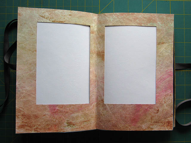
Then I made a template of a scrap piece of painted Tyvek, to use throughout the year whenever I want to quickly transfer this page spread design. In the meantime it tucks into one of the interior pockets. I used Tyvek since it will resist water media.

I will use this journal to mark the turning wheel of the coming year, filling it with scribbles and scrying, sketches for future projects, teaching and learning notes. Just in time for Brighid’s Day, in case some poetry is bestowed upon me, the book is ready.



Very nice, Cari. You do such beautiful work. Your colors are always mesmerizing for me, and resemble some of the finest porcelain stones I’ve used in my work.
Thanks, Julie. I have to say I did not make this wonderful paper but it was irresistible when I saw it and I have been saving it for years. The colors are different colors of paper pulp, so the other side has the color areas much more defined. I loved the subtlety of this side. To me these are all the shades of fire, including black and green.
Breeathtaking Cari! Unique and inspiring ~ now I have even more incentive to attempt making a journal myself, thank you! I even have some paper stashed away, too; similar to that which you have used, only in marbled blues and greens ~ water colors ~ for my favorite element!
Dear Cari, Thank you for sharing the details of your creative process in the making of your magical book. I hope it will fill with peace and blessings for you. xo
Beautiful! I’ve done a few Coptic bindings and they’re so satisfying, with the lay-flat and the pretty pattern of cordage. I love the idea of including pocket-pages interspersed. All my journals bulge horribly because I stuff things in them 🙂 I also like the idea of making a fresh journal for each year. I may have to adopt this tradition…